Thursday, January 31, 2013

How to use Photoshop CS6 to erase unwanted photo background

So I just learned how to use Photoshop CS6 to erase unwanted photo background today, which brought me a great sense of achievement. haha~
For those who lack the drawing skill as I do, I am going to demonstrate how I erased the photo background through Phtoshop CS6.

Step 1: Go to IUWare (http://iuware.iu.edu/Windows) and download the Adobe CS6 package. It's completely free for IU students. 


Step 2: Open the images in Photoshop. Click on "File" and select "Open" to open the images you want. 

In my case, I am going to erase the background of the following pictures, so I will open all of them in Photoshop. But today, I am only going to demonstrate how I erase the background based on the third image.


Step 3: Right click on the "Quick selection tool" on the left-side tool bar and change it into "Magic Wand Tool". 


Step 4: Click on the unwanted white background. 
Use "shift" key to select all the noncontinuous white parts at once. The parts being successfully selected will have dotted delineation. Zoom in the picture for parts that are hard to click on.


Step 5: Go to Menu bar and click on "Select", and the choose "Inverse". 

Now you will see the Eiffel tower has dotted delineation instead.


Step 6: Click on the "Add a mask" icon on the bottom right. 
Now you will notice the background has been removed.
Also in the layer column, there is a layer mask thumbnail. The black part means the part you don't want and the white part means the part you want to keep.


Finally, after finish adjusting the color of your image, save the image as a PNG or JPEG (if you are not creating your infographic in Photoshop) and we are good to go!!
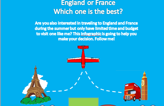

 This is how I created the first section of my infographic. Hope you find this post helpful~


Sunday, January 27, 2013

My infographic storyboard

Here is the initial planning and wireframing of my infographic.
I have also created a prezi slide as my storyboard to demonstrate the logic behind all my design decisions.


Knowledge map for F.Y.I. major project

Janet, Fallon and I are designing the Personal Learning Networks webquest project together as a team. We call ourselves "F.Y.I.- Facilitate Your Ideation".
Here is our knowledge map for the major project proposal.


Friday, January 25, 2013

Week 4: Representation for our major project


Our group is going to design a webquest for learning how to  incorporate  "personal learning network" into instruction. The target audience is  a group of IU preservice teachers who are learning how to use computer in education. 

Based on the readings and Dr. G's lecture on imagery and representation, here are some considerations about the representation for our project.
  1. Graphic organizers: considering the purpose of this project is to teach preservice teachers how to incorporate personal learning networks, one of the potential graphic organizers we may use is a flow chart that help learners visualize the instructional design process. 
  2. Accuracy: Personal learning network (PLN) is a very concrete idea. It refers to websites such as Facebook, Twitters etc. I think, in terms of giving PLN examples, we may use more accurate, figurative pictures to illustrate our points. However, in terms of understanding the whole idea, some abstract images may be included. 
  3. Clarity: the learners will have basic understanding about PLN prior to our instruction, so they are not considered totally novice in this circumstance. Therefore, clarity of our representation may not be high. 
  4.  Learner involvement: the nature of a webquest instructional design requires learners' high involvement. The level of understanding the learners need to achieve should enable them to design PLN instructional activities independently. This will also meet Bloom's taxonomy of cognitive levels "synthesis". 


Tutorial session: Infographics-Planning and Wireframing

  • Web designer vs web developer: very creative example of how to use infographic to present comparative information. Helpful to my infographic assignment. 
  • wireframing:
    • Title
    • Intro paragraph
    • Other information sections
  • Determining what to visualize
    • Infographic is journalism meshed together with design . You are taking research and data, and displaying it in a way that is accessible to a larger audience.
    • Citing information.
    • Generate questions pertaining to the central topic
    • See if the illustration answer our question
  • Two principles for inforgraphic dumbers:
    • Is the data interesting to the audience
    • Can the subject be easier, or more fully understood, via imagery than plain text?
  • Use excel spread sheet to organize your data
    • Overview-sections (table of content)
    • Different tabs for different sections
    • Give each section a title
  • Find stories in your data:
    • Find out the interesting facts from your data
  • Choosing the right visualization (charts I hadn't considered in the past) 
    • Bubble chart
    • Timelines
    • venn diagram
    • Pictograph
    • Relationship diagrams
    • Glyphs
  • Planning dimension:
    • Where? Blog, textbook…?
    • Photoshhop--width: 850; height:5000 (crop it later)
  • On photoshop, use transparent rectangle (or any other shapes)to create your wireframes. 

Monday, January 21, 2013

Week 3: Imagery and Media

Big words: 

  1. Value
  2. Hue
  3. Monochromatic color combination
  4. Complementary color combination
  5. Analogous color combination
  6. Triadic color combination
  7. Dominance --> determined by value and hue
  8. balance
  9. grids
  10. typography
  11. composition
  12. layout
  13. alignment 
  14. proximity


Analyzing value and dominance
  1. what are the lightest structures in display?
  2. Divide them into two more levels of gray values
  3. Are the appropriate elements dominant? 
  4. Is the layout balanced? 
  5. If one element needs to be adjusted, what will the impact be on everything else? 

Typology: 
  1. Text has to be Visible, legible, readable. 
  2. Visibility: 
    • size
    • contrast
    • interference
    • occlusion
  3. Legibility (letter forms): 
    • letter spacing
    • character shapes (image resolution)
    • contrast
    • interference
  4. Readability: 
    • Line length: ideal-2/3 and 1/3 of a standard page width; no scrolling or wall-to-wall text 
    • Letter forms: lowercase letters are easier to read
    • Typeface: Book faces (serif or sans-serif) for texts; display or italic faces for short titles or labels. 
    • justification: ragged right
  5. text as visuals: 
    • The gray value of your text has to be moderate
    • Factors influencing the value: typeface, point size, 
    • You can make your text "shout" through typeface selection, point size, boldness, italics, and color.
    • Typefaces convey affective meaning through metaphor and through common use

Questions to ask: 
  1. Need further clarification on how to analyze the dominance and balance. 
  2. Produce a value analysis and a grid diagram for your assigned website. (where?) 

My Infographic Topics

1. Do you need fish oil? 

Last December, I was choosing nutrition supplements for my grandpa who has heart disease, and therefore I learned that choosing a nutrition supplement is not as easy as you imagine. You need to select the best product for yourself based on your own health condition, nutrition intake, age, gender etc. Taking in the wrong dosage or wrong kinds of supplement might otherwise cause negative effect on your health. It took me such a long long time to do research on this topic since I didn't want to jeopardize my grandpa's health but the information on the internet was terribly complicated. Therefore, I would like to try creating an Infographic about fish oil, telling people

1. who need fish oil?
2. What are the benefits for taking fish oil?
3. How much dosage you need to intake based on your own conditions?
4. How do you choose a safe fish oil product?


2. Travelling to France or Scotland, which one is better? 

My boyfriend and I are planning on a one-week trip to Europe this summer break. So far, we have two options in mind, France and Scotland. It will also be very interesting to me to do some research on the tourism information about these two countries and create an Infographic showing the pros and cons between these two options. Possible categories for comparison would be:

1. Expense
2. Fun things to do
     (1) Natural landscapes
     (2) Cultural landscapes (music, festivals, architectures, etc.)
     (3) Museums
     (4) Night life
3. lodging and accommodations
4. Foods


This is so far I got. Both topics are very interesting to me, but I guess I like my second topic more than my first one. People who are reading my blog, please give me some suggestions on which topic I should choose and what information I should further include. Thanks~

Friday, January 18, 2013

My Infographic design principles


This week, Dr. Appelman came to our class and gave us a very inspiring speech on visual design. He said that "everything is designed with a frame. You as a designer is to decide what is in the frame". This is a great inspiration to me, reminding me to look at the big picture first instead of jumping into the details right away. Fonts, color, spatial arrangements etc. are all details that should be concerned only after you have developed your big picture based on your central concept. Dr. G and Dr. L's lecture on Infographic later on supported this concept. We started from discussing what infographic is and what the objectives for designing an infographic are.  Several infographic examples are introduced based on how they hold onto their central idea while developing the whole picture. No matter  you are organizing your information through "ask question", "tell a story" or "make a comparison", as long as you keep the central concept in mind as the starting point for your design, you will be able to create a successful infographic. So, keep in mind:
  1. Look into the essence of your topic first, 
  2. and then look at the components you may have in the frame,
  3.  then you decide how you are going to develop/organize/ create your picture
Example 1:


This Infographic has a clear central idea and has organized its information according to its central theme. It is really easy for the audience to follow his design logic.

Example 2:


This Infographic is also well-organized. The curvy path indicates the steps we should follow to build up our credit score, which I find to be a very clever and efficient way organize this topic.

Example 3:
This Infographic fails to catch the essence of the topic first. The information provided below does not support the argument the designer set as the topic.After reading the Infographic, I still don't understand why there's a little geek in all of us.

Sunday, January 13, 2013

My Infographic example

Here is my infographic example:


The topic of this infographic is very attracting to me since I have always been interested in educational issues.

The infographic provides organized and concrete information to discuss the expense of a bachelor's degree vs its value. Five themes/points showing the depreciation of bachelor's degree are clearly illustrated through the use of different fonts, illustrations/ charts, space arrangements etc.

I especially like the graphic of "starting pay by degree". By the contrast of height, it clearly shows how the cost of a bachelor's degree is way, way higher than its pay-off for most disciplines. We education majored is sadly one of the lowest starting pays...


Thursday, January 10, 2013

Self-introduction

Hi to my dear friends who are reading my blog now :)
 
    My name is Ai-Chu Ding. You can also call me Elisha. I am from Taiwan and I am a first year doctoral student in the Department of Literacy, Culture and Language Education. Before I came to IU, I majored Foreign Languages and Literatures at National Taiwan University. After student taught English in a Taiwanese junior high school for half year, I went to University of Michigan and got my master's degree in Education Policy there. This is my first time taking course opened by the IST department and I am kind of a newbie in the area of IST. Not too many of you have met me yet because I was absent from our first class meeting due to some personal reasons. However, when I listened to the class recording, I really wished I were there to join all of you. The topic of this week was so interesting and the class discussion was so vigorous and intriguing!! I wish I hadn't missed the discussion.... anyhow, I am really looking forward to seeing all of you on next Monday.

    The reason why I am taking R541 is because I have always been interesting in knowing how we can improve our instruction, making it more effective and motivating. Now that I have taken the first class, I am even more certain about how much this class is going to help me become a better instruction designer.